I draw from both traditional and modern styles of visual art. My work is focused on realism rather than abstract art, and my style is between loose painterly, or impressionist, and fine realism (no hyper-realistic art here!).
I draw my subjects from real life, generally through photography. I use a Canon EOS RP full-frame mirrorless digital camera. For still life paintings, I use a proper light box in my studio, and go scouting for landscape or action shots. I also use my own photos from previous travels.
Techniques and Materials
While direct alla prima oil painting has its beauty and advantages, my approach is based more on that of the traditional masters, who included time as a critical ingredient in their work. This accommodates a different repertoire of application techniques such as layering, scumbling, and dry brushing and blending. In particular, it allows the artist to build up layers and to introduce transparent glazes, thus creating more depth of colour and value than is possible with wet-into-wet painting.
Methods
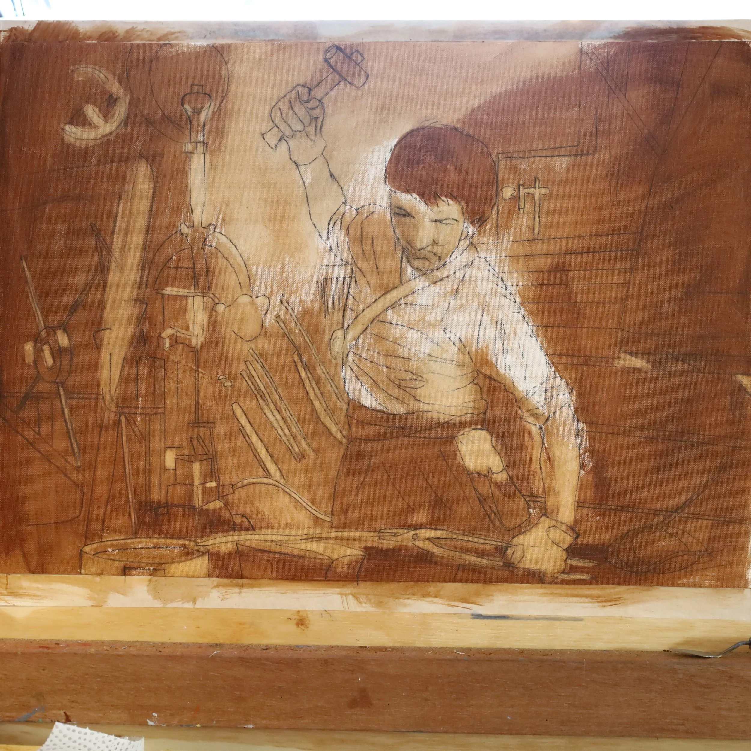
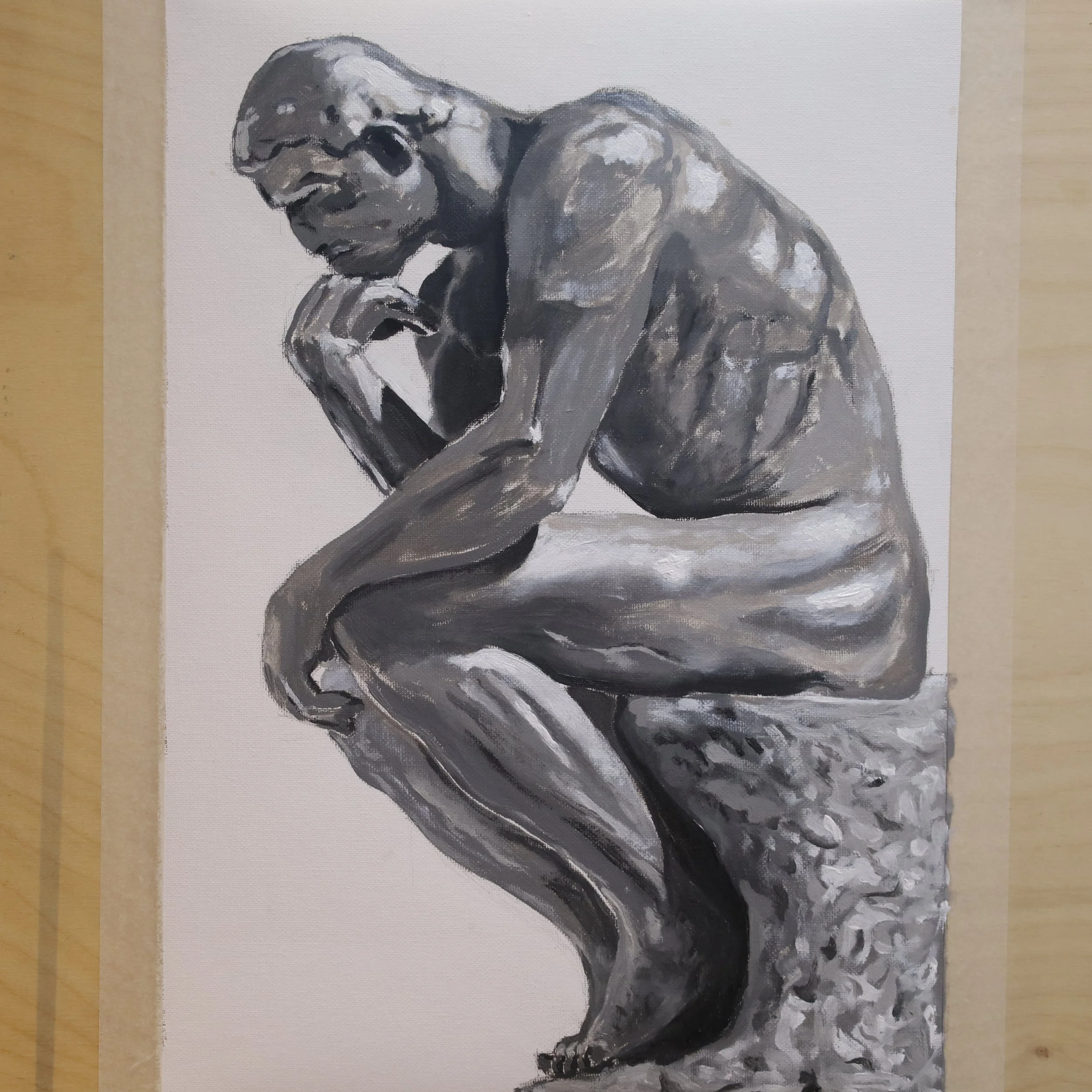
I invariably start an oil painting with a basic drawing in pencil or charcoal, just to get the placement of features and details correct (I trained way back in engineering drawing, so it’s in my blood). Depending on the nature of the subject, I will then either paint directly onto the surface, or will go the indirect route with an underpainting. The underpainting might then evolve into a full grisaille, one of my favourite methods. This is a full and detailed greyscale version of the final work that, once dry, has layers and glazes applied to it to render the colour. You can see a sample of a grisaille at left. It can be done in full greyscale, or more traditionally, in shades of a base colour like burnt umber, black and white.
Read more on grisaille by pressing on the photo here.
Materials - oil painting
For oil painting, I use a variety of surfaces, or substrates. On the cheaper end, medium-density fibreboard (MDF) is easy to use and fairly robust, but is susceptible to moisture - I use it mainly for studies prior to a full version of the painting. It can be used smooth, or have cotton canvas or linen glued to it to create a more traditional and rougher surface (very nice for landscapes and some still lifes). This is a very common substrate used by artists today.
Alternatively, I use stretched cotton canvas or linen like you see here on hardwood stretcher bars that I make myself. This yields a lovely surface to paint on once the priming has been done. This material is what most people associate with oil paintings. I usually make these myself using hardwood for the stretchers and heavy imported linen for the substrate.

Finally, for premium paintings, I use aluminium composite material (ACM) panel. This is a modern twist on the original tradition from centuries ago of painting on copper. ACM is made of two thin layers of aluminium separated by a filler of polyester, and as such it is impervious to moisture, doesn’t corrode, stretch or warp - perfect for paintings that need to last for generations.
All painting surfaces are prepared with three layers of ground, or gesso (“jesso”). I paint these over an initial double layer of acrylic paint if I’m using ACM to ensure adhesion (which is very strong). Gesso provides a non-absorbant surface for the paint to bind to as well as a slight roughness (or “tooth”) to enhance adhesion.
I paint with a variety of international and local brands - mainly Lukas from Germany, Maimeri from Italy, Winsor & Newton and Michael Harding from the UK, and Gamblin from the US.
Once my paintings are dry, I use either a gloss or satin varnish (Gamvar) to protect them and to bring out the colours. This ensures that my works achieve archival quality so that they will last for decades and beyond.
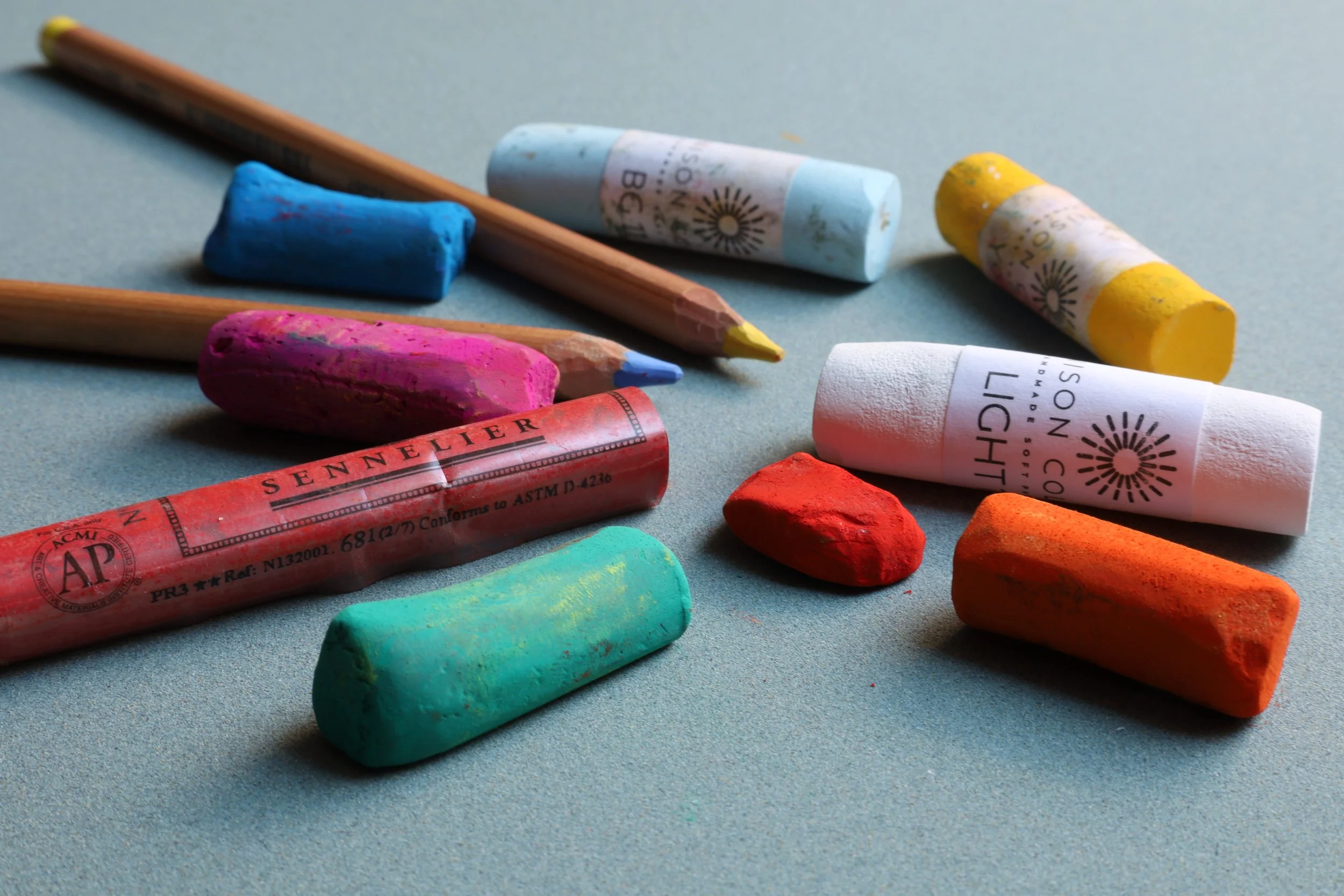
Materials - pastels
Dry pastels (similar to chalk) have a long history in art. They comprise pigment held together by a binding agent, and they are pressed into a rough paper as you would with chalk. I use two of the top international brands - Sennelier from France and Unison from the UK. For finer detail work, I use Faber Castell Pitt pencils.
Pastel paintings are fragile because they’re just powder pressed into what feels like sandpaper. Kept behind glass, though, they last for centuries. Most artists spray their final pastel work with a thin layer of fixative to hold the upper layer in place. It’s not entirely necessary, depending on the substrate used. I generally use Sennelier Carte because it has a great roughness (or “tooth”) that holds the pigment really well.
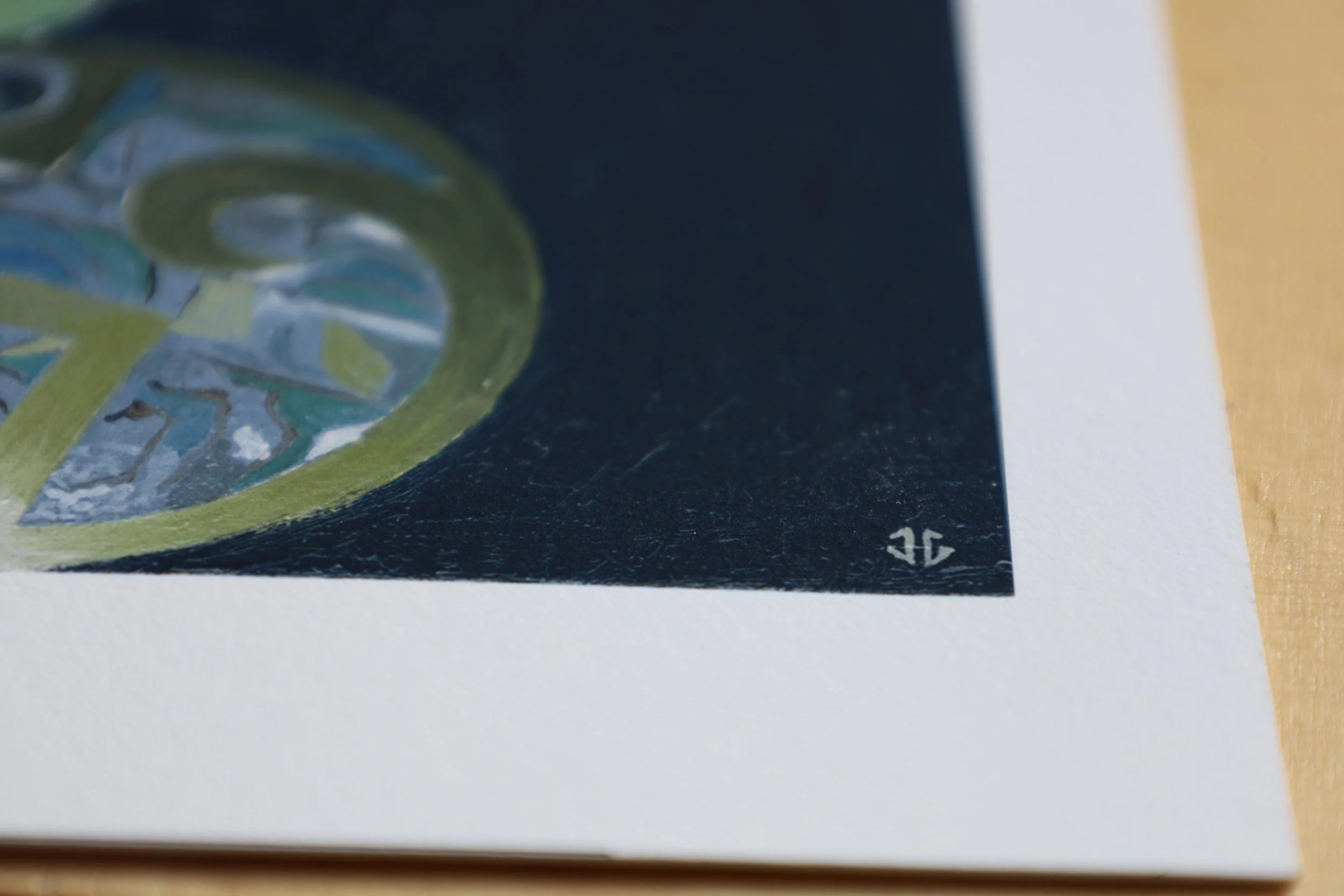
Materials - Giclee prints
My prints are professionally rendered to archival standards on 310gm, 100% cotton paper from Germany, with a gently textured surface. This paper is free of optical brightening agents (OBAs). They are printed in the latest generation Epson Ultrachrome archival pigment inks. This is the ink-set that started the pigment print revolution and twenty years on continues to be the leader in terms of lightfastness, colour gamut and D-max. What this means is that once you frame such a print, it will be of a higher quality and more robust than most original art that is created on canvas, linen or board since the more traditional oil paints and materials are not guaranteed in terms of lightfastness and resistance to natural degradation.